A new home for Hana Games
We rebuilt the studio website from scratch. A darker stage for the games, one red that means something, and type that survives twenty languages.
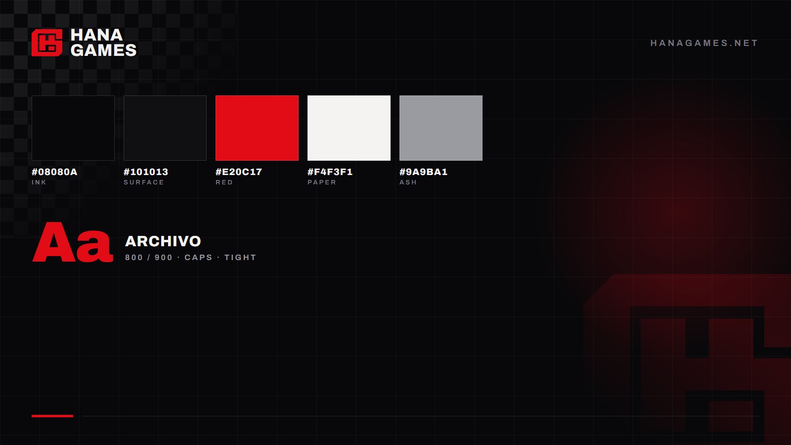
Hana Games has a new website. Not a fresh coat of paint - we took it down to the frame and put it back together.
Why
Honestly? Because the old one was ugly.
It had grown heavy and grey. It looked like a template. It said nothing about the games we spend our days on, and we had been patching it for months instead of admitting it. At some point the honest move is to start from zero.
The colours
The site is almost black on purpose. Ink (#08080a) is the background
everywhere, with a slightly lighter surface (#101013) behind panels, so
the artwork is always the brightest thing on the screen.
Then there is one red: #e20c17. It is used sparingly, and always for the same
few jobs - a section label, the main button, the short line under a title. When
everything around it is calm, one red is enough to say look here.
Text is off-white - we call it paper (#f4f3f1) - rather than pure white,
which glares on a dark screen. The secondary grey is kept light enough to stay
readable, because grey text is where websites usually lose people.
The type
Headlines are Archivo, in heavy weights, set in capitals, with the lines packed almost on top of each other. It is a grotesque with a bit of industrial edge, which suits people who build worlds for a living.
Small labels use the same family with very wide letter spacing instead of a second font. It is a cheap trick, and it makes the whole site feel like one piece.
Body copy is a neutral sans, chosen for one boring reason: it has to survive twenty languages without falling apart.
The shapes
Corners are cut, never rounded. It sounds like nothing, but it is the detail that makes the site feel like ours - a nod to arcade cabinet panels and printed posters, not to software.
There are exactly two decorations: a thin technical grid, and the checkerboard from our logo. No drop shadows, no frosted glass, no gradients pretending to be light.
The motion
There is barely any. A rule draws itself under a title. A poster turns over every few seconds. The logo can be grabbed and spun, because a 3D mark is fun once. Everything else holds still - and anyone who has asked their system for less animation gets none of it.
And the games
They come first, which was the whole point. The studio, the news, this page: all of it comes after.
- Studio
- Website